Tuesday, August 3, 2004
By: Matthew Doucette
On August 22, 2000, Joel Spolsky wrote "anti-aliased text looks better... Wrong"! He had a point:

(What is antialiasing? Antialiasing is a computer graphics process that removes the jagged edges or sawtooth distortion in diagonal or curved lines so that they appear more realistic. This is done with the addition of extra shades of color. So black text on a white background will have some shades of gray to better approximate a "smooth" font. The idea is that pixels that should not be completely "filled up" with one color or another should have some shade of color in between. You can visualize how this only affects the edges of the text font.)
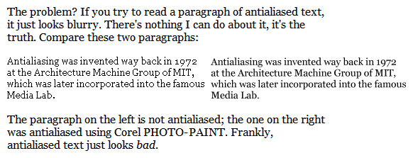
That is the same snapshot that Joel used in his article. The anti-aliased text, via Corel PHOTO-PAINT, (on the right) looks worse than the aliased text (on the left). The antialiasing makes the text looks very blurry, especially the third line.
Corel's is not the only type of anti-aliasing:

The additional paragraphs in the above image are a snapshot of how Joel's article looks on my screen. The top and bottom paragraphs are also anti-aliased, and they look better than both of the original paragraphs (the two in the middle). The antialiasing method I used? Microsoft Window XP's ClearType.
Note: If you have an BGR monitor (very unlikely) instead of an RGB monitors, then the screen capture of my computer's anti-aliased text will look blurry. My computer's anti-aliasing is specifically set for only RGB monitors, as that's what I use. RGB vs. BGR and how it corresponds to anti-aliasing is explained further in this article.
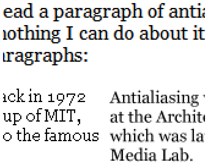
Let's zoom in on the above image and take a peek:

Now, to clarify, the text above is anti-aliased text using my computer's settings (the best), the text to the bottom-left is aliased text, and the text to the bottom-right is anti-aliased text using Corel PHOTO-PAINT algorithm (the worst).
Why Does Corel's Algorithm Look the Worst?
Examine the capital "A" letters in the Corel PHOTO-PAINT text. They are different, although based on the same aliased "A" letter. Why? The text is aligned with sub-pixel placement.
Sub-pixel placement means that any letter can be placed at fractional pixel locations. No longer is text restricted to integral pixel location values such as "10 pixels over and 10 pixels down". Now they can placed at fractional values, such as "10.45 pixels over and 10.27 pixels down". Examine the two capital "A" letters again. The reason they look different is because they are not aligned on the pixel grid with identical fractional pixel values. It is the sub-pixel placement of the letters that causes the anti-aliasing to look bad... not the anti-aliasing itself.
To further explain, check out the bottom of the letters in the third line ("which was la...") versus the bottom of the letters in the first line ("Antialiasing..."). The bottom of the letters in the first line are perfectly aligned with the pixel grid, so they look clear. However, the bottom of the letters in the third line are not aligned perfectly, and thus looks blurry. If the letters were sized and placed properly to minimize the sub-pixel distortions first, before antialiasing, then the antialiasing would look better.
Why Does Microsoft's ClearType Algorithm Look the Best?
It has anti-aliasing without sub-pixel placement. The lack of sub-pixel placement removes the washed-out look. My computer's text is placed with integral values. It has no sub-pixel placement. In other words, the text is placed perfectly first, then it is anti-aliased second. This avoids all the extra blurring that is so evident from Corel's PHOTO-PAINT text renderer.
Sub-Pixel Anti-Aliasing
Be careful, what I mean is sub-pixel anti-aliasing, not sub-pixel placement as explained before. To see what this is, look at the zoomed-in image of my computer's text. You can tell as the left side of each part of each letter is more red and the right side is more blue. How is color introduced from anti-aliasing black text? If you had an LCD (liquid crystal display), those colors would be accessing the sub-pixels of each RGB (red-green-blue) pixel. "RGB" means that the red element is to the left, the green element is in the center, and the blue element is to the right. A pure blue color would "access" the right-most sub-pixel of that pixel. Therefore, the additional color evident in the zoomed-in image indicates it has sub-pixel anti-aliasing.
This is tricky to explain...
Sub-pixel anti-aliasing on an LCD has, theoretically, 300% more definition or resolution than regular anti-aliasing, and thus looks way better. (Don't get me wrong, an actual 300% increase in definition, without the use of sub-pixels, would look better.) However, sub-pixel anti-aliasing on an LCD is not what I am talking about in this article, as I do not own an LCD display. If you would like to see how it looks on an LCD, Steve Gibson's Sub-Pixel Font Rendering Technology article explains sub-pixel font rendering in much greater detail and has pictures of actual LCDs with it enabled.
So what am I talking about?
With CRT displays, like I have, sub-pixel anti-aliasing still looks good (although it was invented only for LCD displays). Gibson says regular anti-aliasing and sub-pixel anti-aliasing will look the same on CRT displays. He mentions that the reason sub-pixel anti-aliasing, for LCDs, still looks good on a CRT display is that it is still doing anti-aliasing. In other words, it is the anti-aliasing that causes it to look good, not the sub-pixel anti-aliasing added on top of it. The sub-pixel stuff (which he think causes no difference on a CRT) is supposedly irrelevant.
Gibson has a The Free and Clear Demo that demonstrates all of this. In the demo, you can set the mode to be RGB or BGR. "BGR" means the blue element is to the left, the green element is in the center, and the red element is to the right. This is the exact opposite of the more standard RGB. Some LCD displays have the order reversed, so it is necessary to have sub-pixel anti-aliasing that handles both ways. Anyway, on a CRT, if you switch from RGB to BGR and see no difference, then that is proof that the sub-pixel stuff is irrelevant. Think about that.
However, on my monitor, and I can only speak for my monitor, sub-pixel anti-aliasing with RGB looks better than with BGR! This is proof that the sub-pixel stuff is relevant. It also looks better than regular anti-aliasing. Why? I am not 100% sure. However, I do know that the text is just easier to read and, upon close inspection, the lines in each letter of text is smoother and clearer. Perhaps my monitor's dot-pitch is high enough or set to some proper value that, somehow (anyone care to explain?), the methods uses for LCDs slightly work for my CRT. I am not getting a 300% improvement, by any means, but there is an improvement, however subtle.
Enable Microsoft Windows XP's ClearType
Test it out for yourself. Enable Microsoft's ClearType sub-pixel font smoothing:
- Visit ClearType Tuner PowerToy
- Download the setup.exe
- Run setup.exe to install ClearType Tuner PowerToy
- Once you are instide, pick the clearest font possible. The clearest font varies depending on your monitor resolution. This is because the lower the resolution of your monitor, the more powerful the effect of ClearType. The strongest or darkest ClearType fonts are too powerful for 800x600 and other low resolutions. The main point is to not strain your eyes. Whatever is easiest to read is the clearest font.
Also See:
External Links:
- The Free and Clear Demo (grc.com)
- Sub-Pixel Font Rendering Technology (grc.com)
- ClearType Tuner PowerToy (microsoft.com)
About the Author: I am Matthew Doucette of Xona Games, an award-winning indie game studio that I founded with my twin brother. We make intensified arcade-style retro games. Our business, our games, our technology, and we as competitive gamers have won prestigious awards and received worldwide press. Our business has won $190,000 in contests. Our games have ranked from #1 in Canada to #1 in Japan, have become #1 best sellers in multiple countries, have won game contests, and have held 3 of the top 5 rated spots in Japan of all Xbox LIVE indie games. Our game engines have been awarded for technical excellence. And we, the developers, have placed #1 in competitive gaming competitions -- relating to the games we make. Read about our story, our awards, our games, and view our blog.
